Another Day Consulting Logo
When I was asked to design a logo for a new consulting company, I took a bit of a different approach and took more time to sit with the client, Lindsey Ross, to ask her exactly what her goals were with the logo.
I asked her about the name of the company and where it came from. I asked her if she had any images, or even elements of ideas, floating around in her mind. I asked her about her feelings on colors and fonts. We sat together and reviewed hundreds of different logos just to brainstorm ideas and elements she liked.
And even before I began sketching out different versions, that initial interview gave us what ultimately became the basis of the final logo for Another Day Consulting.
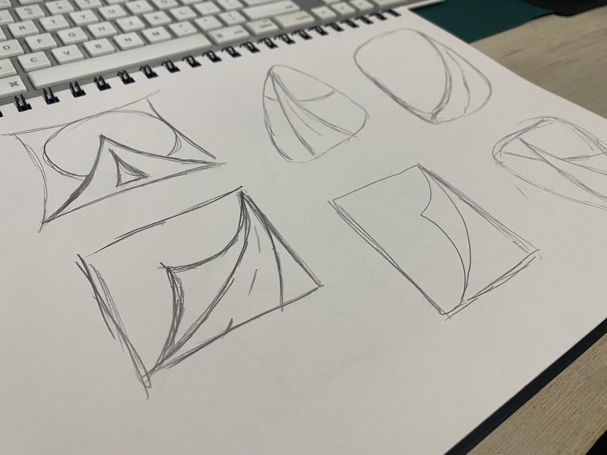
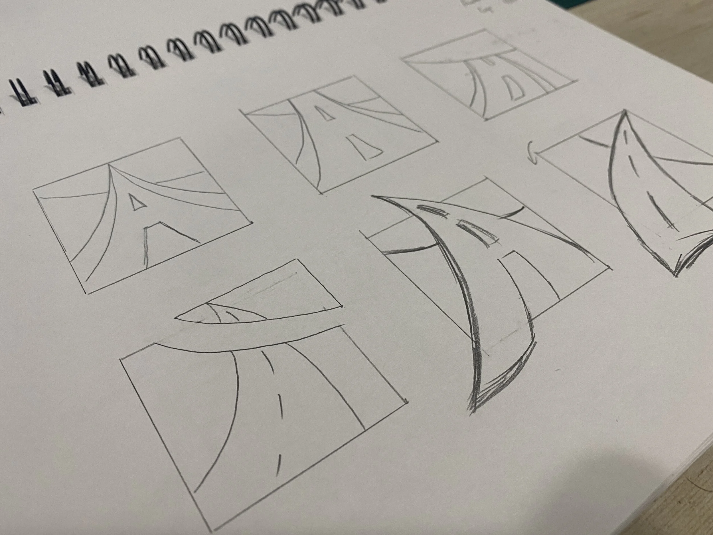
Pictured here were 6 of a total 35 sketches I sent over to the client to review.
Even though Lindsey had a very solid idea in her mind, I wanted to sketch out multiple different versions. The intent behind continuing to sketch out ideas was so that if she continued to come back to her original idea, we would know without a doubt we had explored different options and were on solid ground heading forward.
This was the original sketch the client produced after our initial brainstorm.
Over 70 Digital Versions
-
Right Direction
In these early versions, we had walked away with an initial idea on color and general ideas about the logo elements. I took her original sketch and created a digital version along with several others I had hand sketched. The main goal coming out of this round was to solidify if we were heading down the right path.

-
Next Steps
After the initial versions, we had both agreed the colors were not what we were looking for however, we had landed on the basic concept of a road fading into the distant horizon. So I put together another round of sketches, digital versions, and new color palettes.

-
Finishing Touches
After honing in on a color palette and locking down shape elements, I re-introduced the name to the logo so that we could focus on placement and typography. I presented another series of versions and we continued to narrow down ideas until the project was finished.

“As a new small business owner, I had no idea where to start. I am so thankful for Michael Gilley and his professionalism and process oriented mindset. He guided me through the entire logo development process, which ultimately helped me in many areas of the company. He was extremely thorough in finding out what specific vision and branding would represent the business that I was building. He created the exact image that I had no idea I wanted or needed and it is perfect! I would recommend him 10 out of 10 times.”


