Visum.
Visum is a fictional virtual art gallery app I created as a part of my UX Design certification. Below is the case study regarding the different phases, iterations, and mockups I created throughout the build.
There’s still a ton I am learning but I am also extremely excited with every step I am taking forward. Especially as I am beginning to see my graphic design skills manifest in the UX design process.
-
Time Frame
October 2021
-
Product
Designing an app that allowed users to experience the world’s best art galleries, museums, and artists as if they were there in person.
-
The Problem
Gaining access and interacting with the world’s greatest art and artifacts is nearly impossible without traveling around the world.
-
My Role
UX Design Lead / Graphic Designer
-
My Responsibilities
Conducting user research, competitor audits, composing storyboard scenarios, user personas, building wireframes, low-fi and high-fi prototypes, etc.
-
The Goal
Bring the art and users together through a digital medium that allows them to experience the art and learn more.
User Research
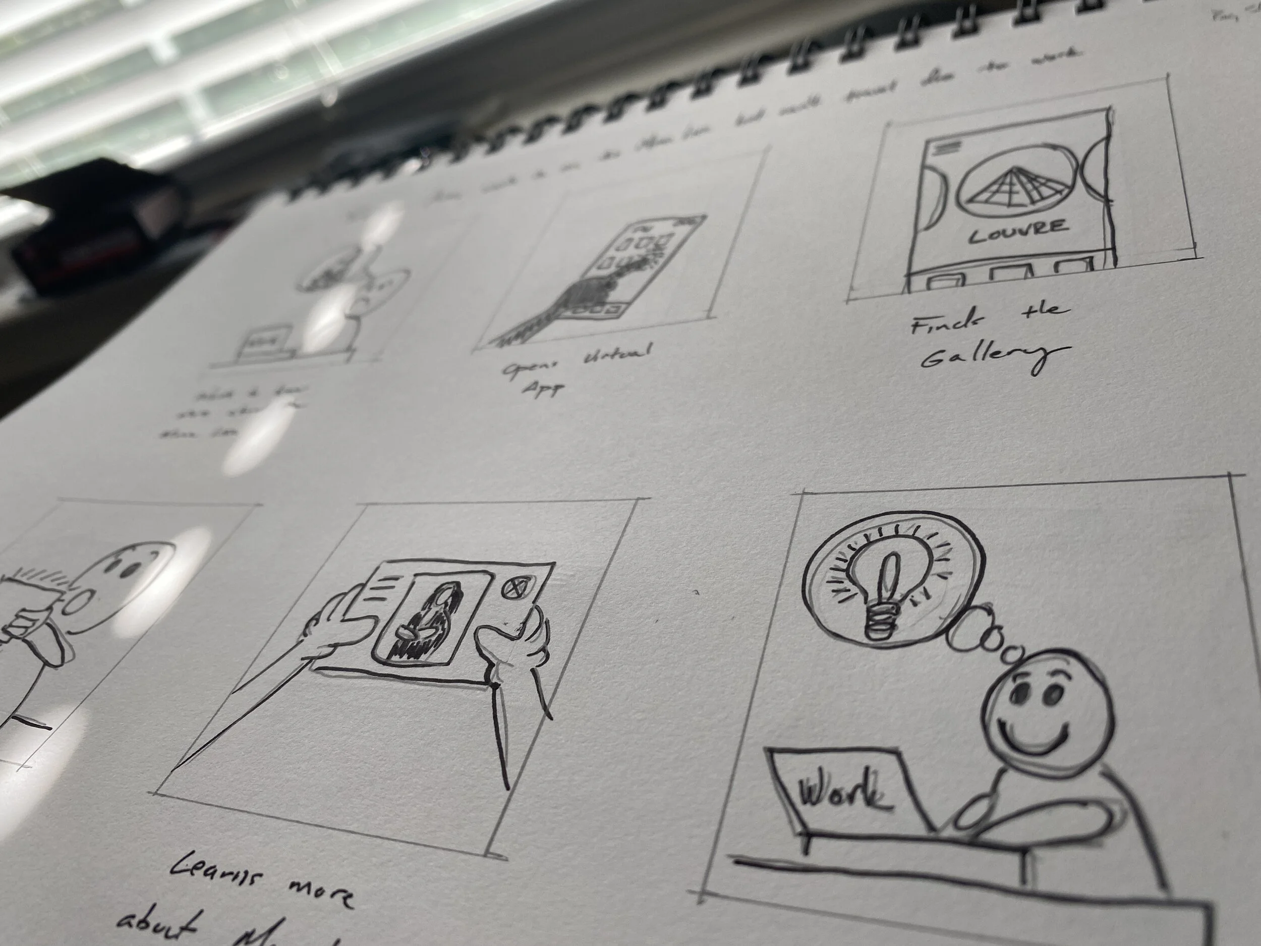
I conducted several face-to-face interviews with potential users from around the United States with the intent of uncovering any information that may help shape the design of the app.
Asking questions about their personal experiences with real art galleries and museums, my goal was to identify themes regarding pain points that the app could solve.
I also probed the users about their experiences with other apps that had characteristics of virtual reality that I thought might be incorporated into my design. What I found were interesting features that had not been incorporated into the traditional art gallery experience that could actually resolve some of the users pain points I uncovered.
Identifying User Pain Points
Anxiety
Anxiety about being in large crowds in confined spaces, especially with a pandemic ongoing.
Access
No up-close or hands on access to the art. No way to get physically close even when attending in person.
Background
Users discussed the lack of information regarding artist techniques, the mediums they used, and information about the artists.
Children
Users also discussed the lack of access to art for children and how museums would fear children damaging the art.
Iterations.
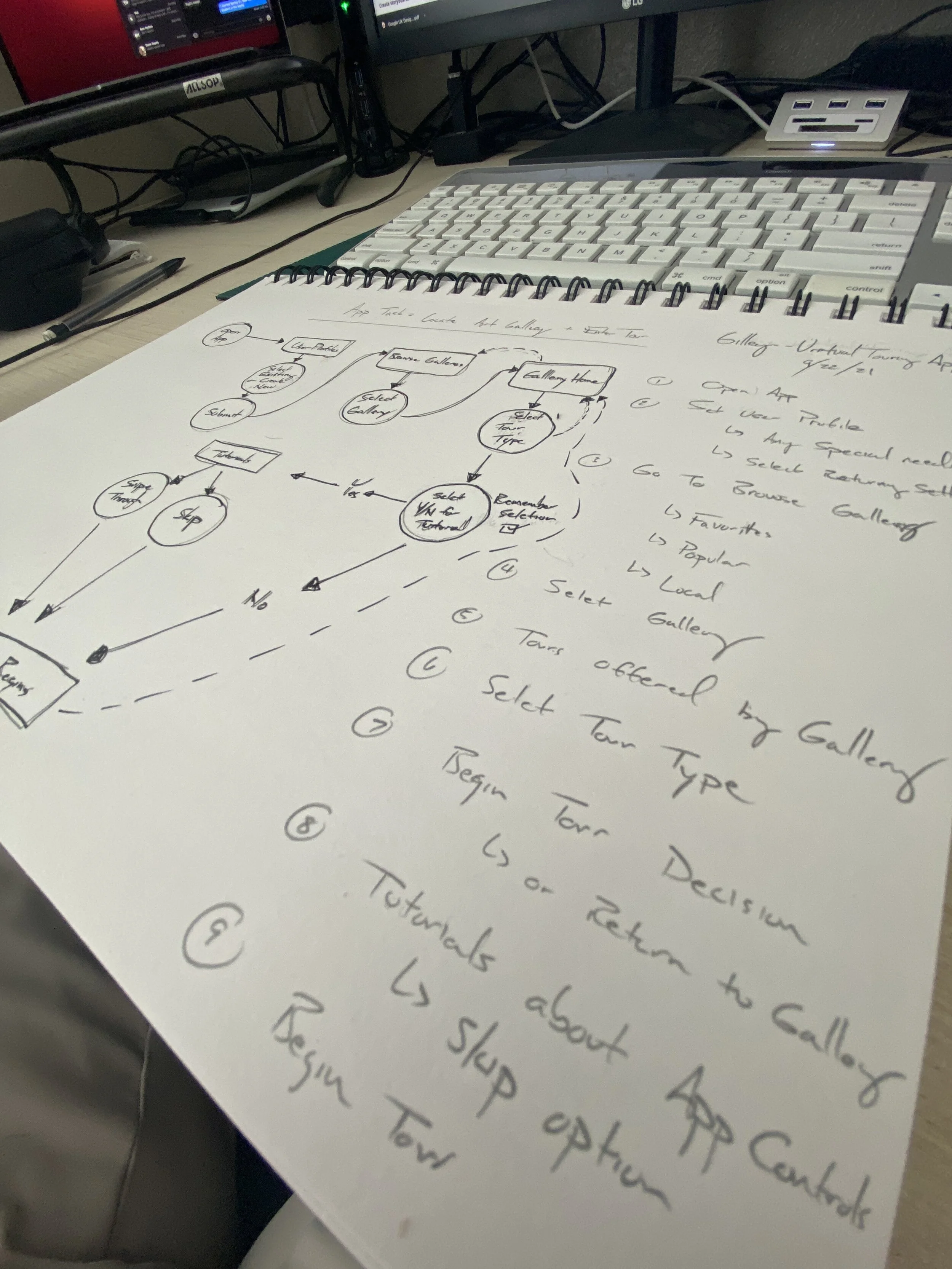
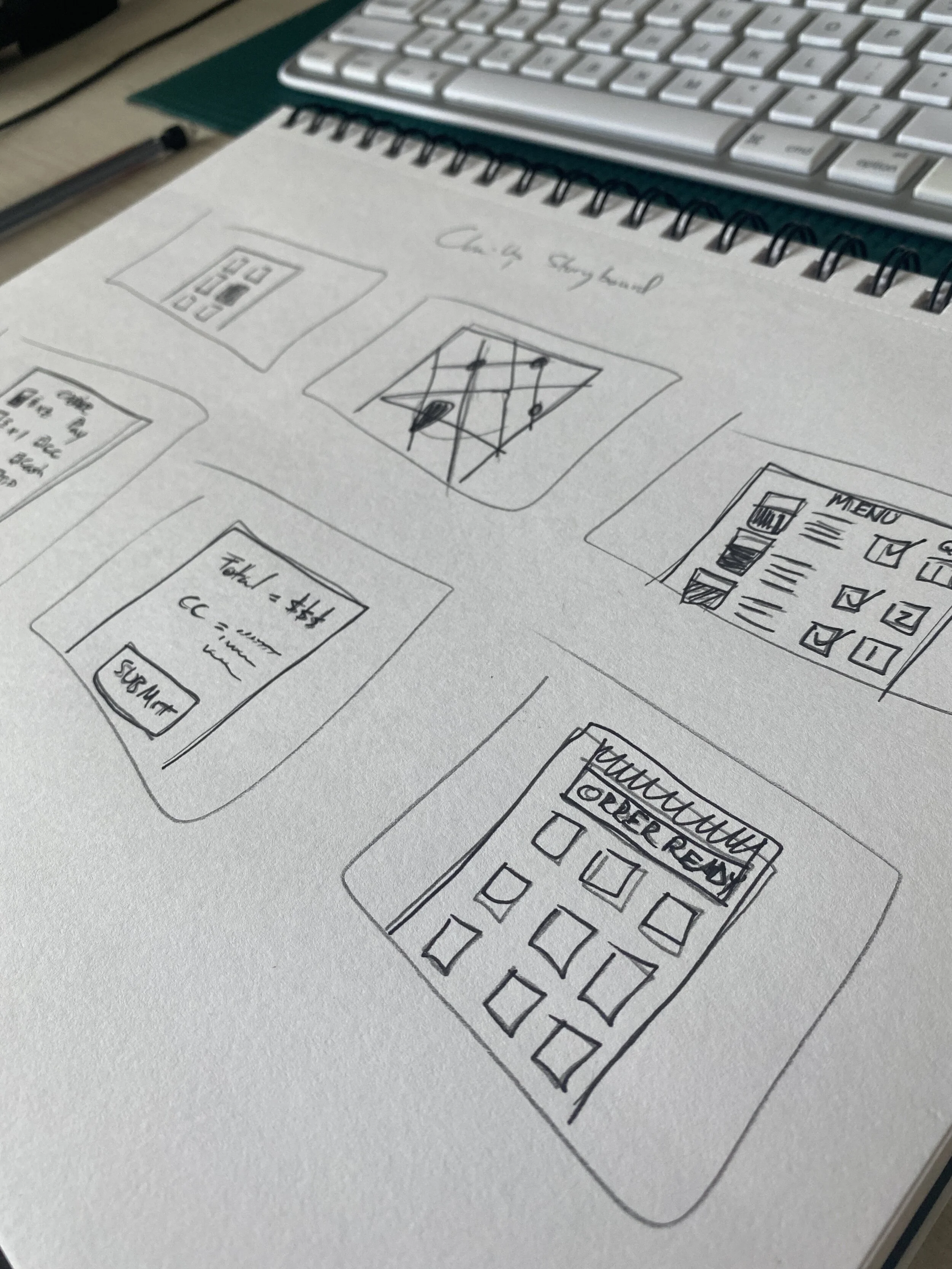
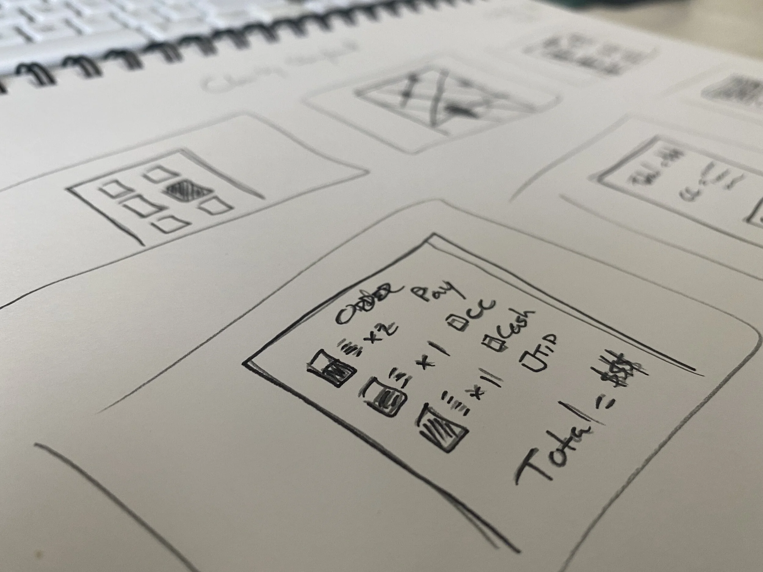
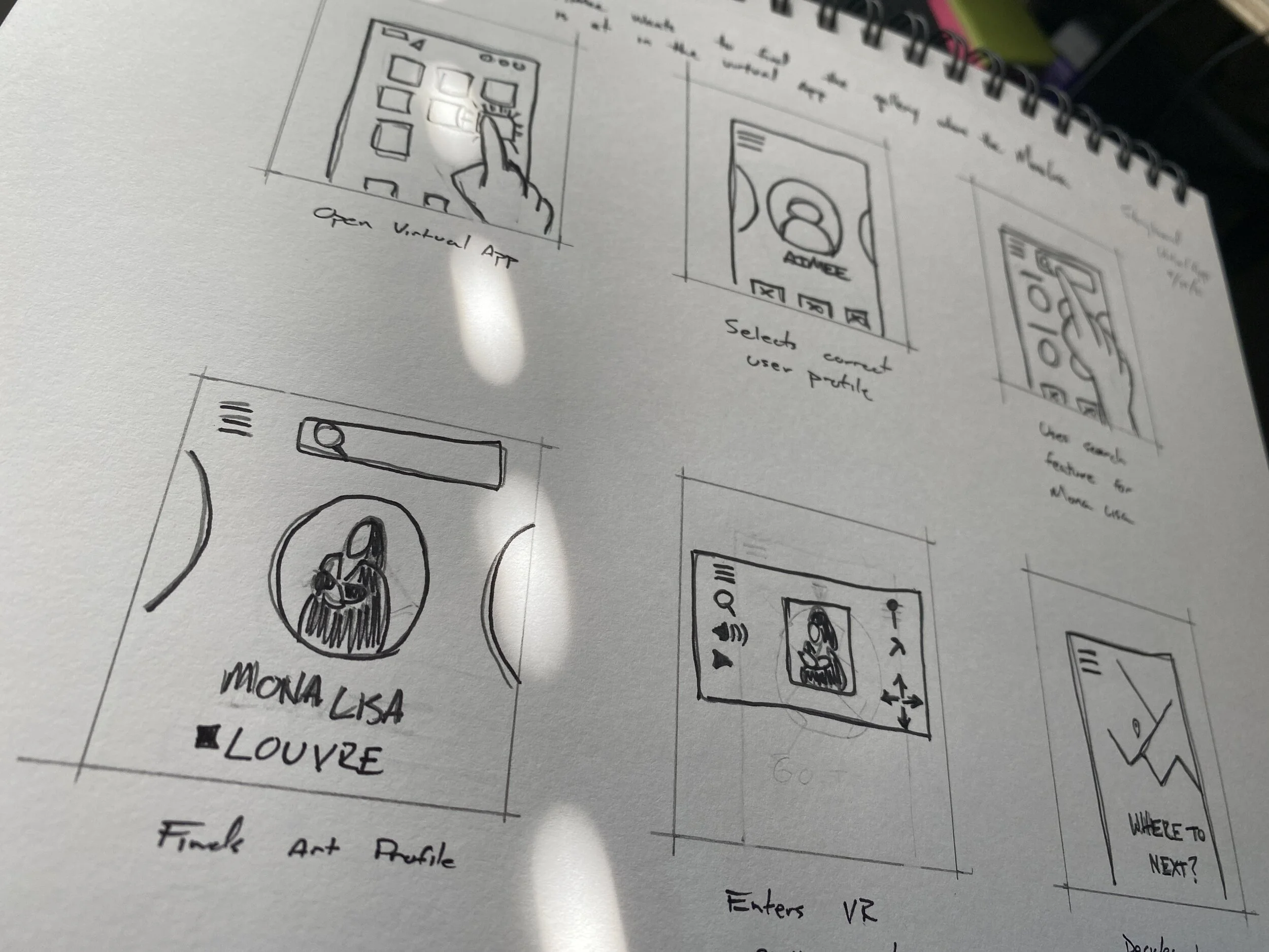
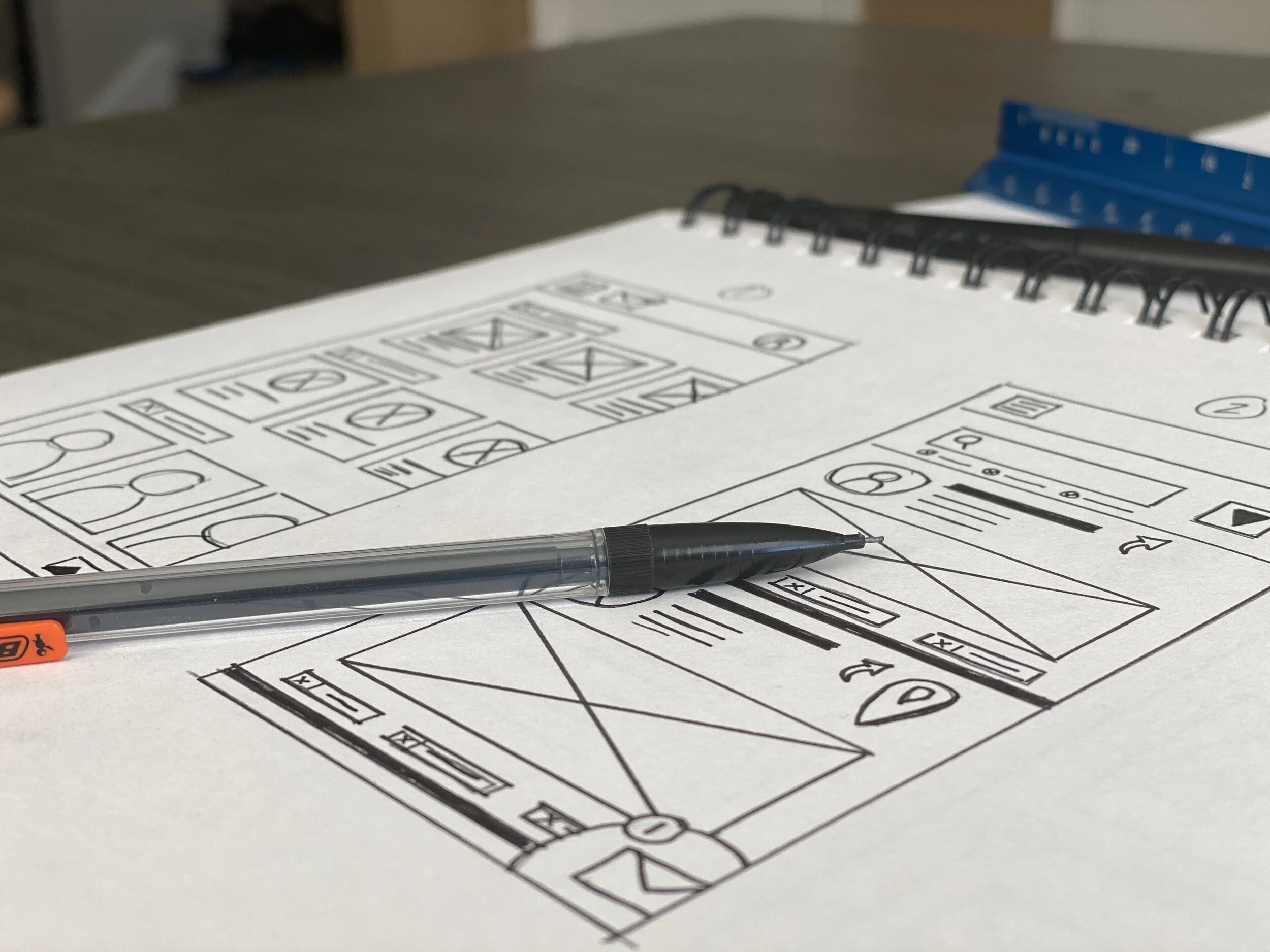
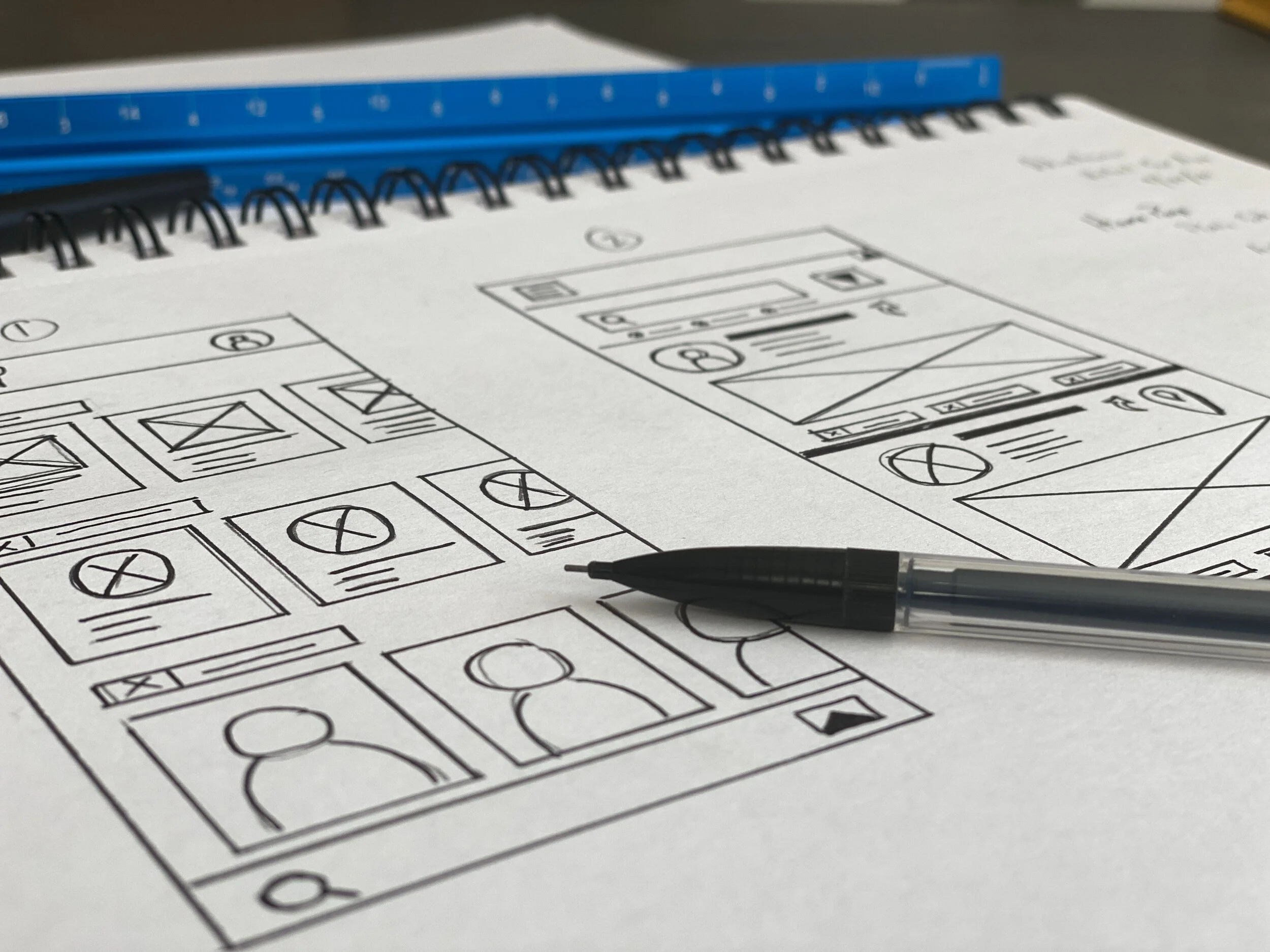
You can see my initial hand drawn wireframes where I was attempting to resolve the pain points I had discovered in my initial user research. I also conducted some competitor audits where I downloaded different versions of virtual reality apps.
I also began incorporating different design elements I had seen in other apps unrelated to art galleries that I found useful. For instance, the navigation controls from different FPOV shooting games would be very useful in navigating around a VR environment.
Lo-Fi Prototype
Here is one of my early low-fidelity prototypes that I built. The goal here was to have a prototype ready to conduct my first usability study with users.
Usability Study. Research Impacting Design.
-
Wireframe
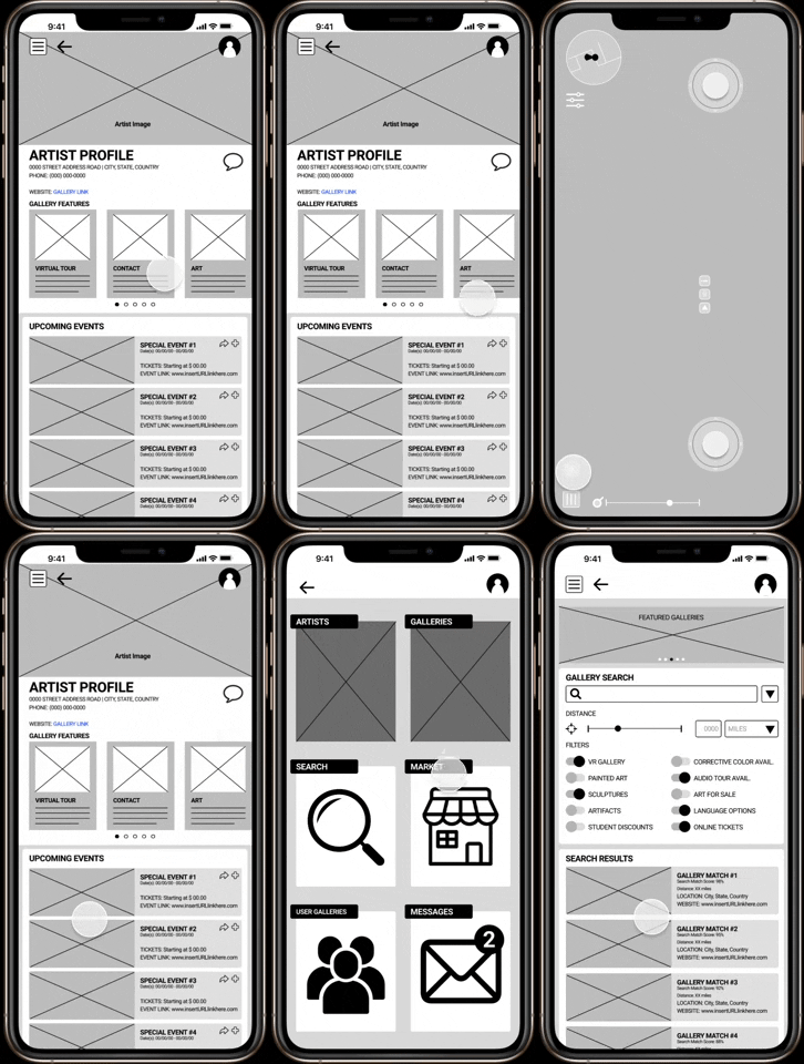
In this example you can follow the different design iterations from the initial wireframe to the high fidelity prototype.

-
Low-Fidelity
After the first usability study, 3 out of 5 users noted that they did not notice the swipe gesture functionality for the Gallery Features. So I added the dots below the sections as a way to resolve.

-
High-Fidelity
However, the initial concept was altered to be more reliant on iconography vs unreadable small text and the dots were replaced with an arrow feature to indicate which sub-heading the user was currently viewing.

Final Prototype
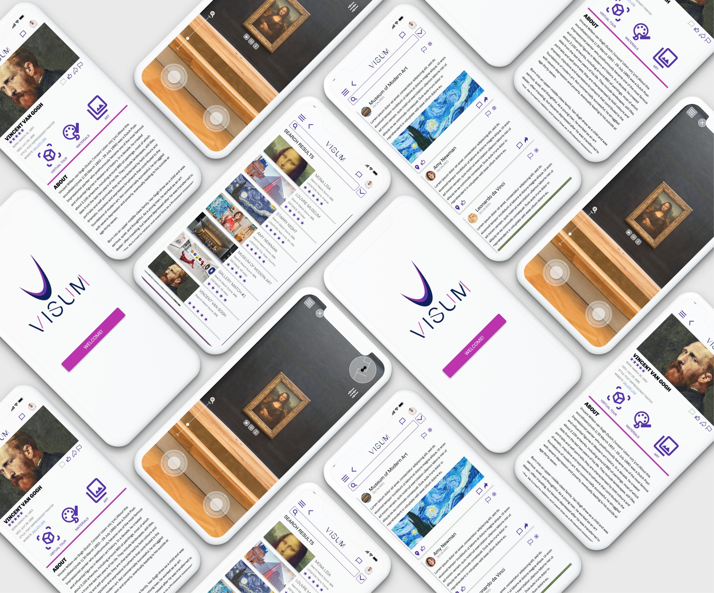
In the end, I was able to conduct user research that established a clear goal, paint points, usability feedback, and also make use of my graphic design skills to create a brand presence throughout the UX design.
“This app is incredibly intuitive and easy to explore. Features are in logical places, and I don’t need to hunt and peck to find things.”
— Marcus Hopkins


